
In the Showcase's first ever on-house exterior art installation, Simon Breitbard Fine Arts commissioned artist AJ Oishi to paint a series of concentric circles on the façade, giving the home a bubbling, fizzy appearance. All colors are from Farrow & Ball.


Molie Malone (who did a fantastic orange and black and white bathroom for last year's Showcase) graced the entrance with hand-crafted metallic/shimmery wallcoverings from de Gournay (their new San Francisco showroom is now open!) inspired by the glint of sunlight on water. I'm sure the San Francisco Bay--which is a stone's throw away--was an inspiration. Hanging in the stairwell is a marvelous mesh-covered piece by Fuse Lighting.


The first proper room on the tour was a dining room but in the hands of designer David Bjørngaard, it became an art salon. He clearly states that the inspiration for the room came from the magnificent views of the Marin Headlands seen outside the window. "Materials and colors connect to sand, driftwood, sage, and sky. The dining room is a sensory escape where refined detailing and materiality are celebrated, acting as a backdrop for the owner's passion of art and collectible furniture." British artist Julia Condon created the airy, colorful mobile hanging above the table. I particularly liked the Kyle Bunting green hide rug!


This year's kitchen--and adjacent family room--went to talented Ian Stallings who took vintage, black and white screwball comedies as his inspiration seeing as the home was finished in 1930, the era of screwball comedies. But Stallings says he decided to turn on the Technicolor for the kitchen. Even though he did that, it seems like it still nods to black and white. Dark navy Bluestar appliances were coordinated with the cabinetry color and the navy and white backsplash adds to the monochrome feeling. The space is warmed up with pierced brass cabinet fronts with brushed brass and acrylic door and drawer handles. Over the peninsula is a lyrical light fixture of gold branches.


Open to the kitchen is the bright and modern family room also by Stallings.


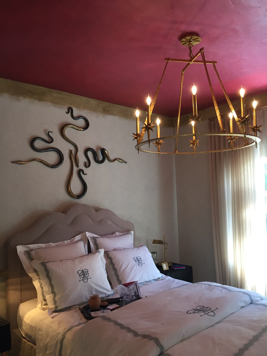
A lararia was a shrine in ancient Roman households to spirits who protect the home. And Kari McIntosh Dawdy took that idea from a recent trip to Pompeii as inspiration for a fascinating guest bedroom which features a ceiling of red Venetian plaster, a Venetian mirror, and images of snakes which the ancient Romans believed brought abundance and good fortune. Dawdy says she installed her version of a lararia in the closet with frescoes of trees, snakes, and a faux-mosaic floor!


de Gournay wallpaper showed up again in the Lemondrop Lullaby nursery designed by Dina Bandman (who did a fantastic laundry room / dog washing station for last year's Showcase). Purposefully using a gender-neutral color palette of yellow and green (which frankly, is so much more sophisticated that the tired, predictable, and constricting pink and blue), Bandman built the room around de Gournay's hand-painted, hand-sequined, and hand-beaded wallcovering of lemon trees. And her trellis ceiling treatment is absolutely charming.


Fabricator Susan Lind Chastain and decorative painter extraordinaire Willem Racké created an engaging yet cozy space in a tiny little nook of a room. They called it the Tangerine Dream Lounge and the color palette was inspired by orange creamsicles from our childhoods! I loved the orange ombré curtains from Chastain!


Ceilings are the fifth wall in every room but they are so often overlooked. I try to incorporate ceiling treatments in my own designs as the results can be striking and really make a room. Such is the case with a small bathroom designed by Stephan Blachowski. Entitled "Above, The Garden Awaits," stripes of quartz material clad the walls while a riotous floral mural by Willem Racké blooms overhead!


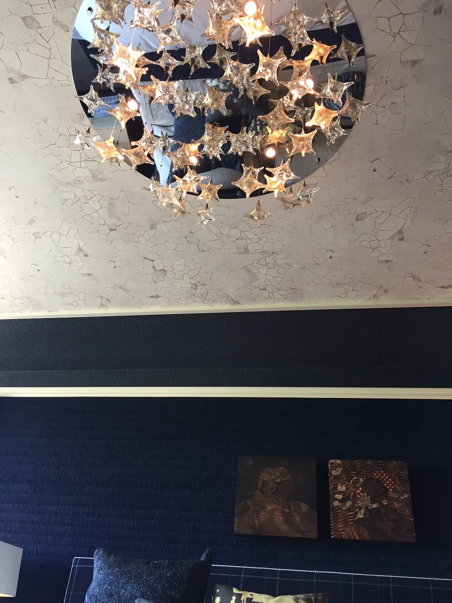
A glorious, dark, moody powder room by Beth Daecher was up next as I made my way through the house. She describes the room as a calm oasis and likens stepping into the room to the feeling of being on a luxury yacht. Porthole mirrors, buoy pendants, and a Phillip Jeffries wallcovering that evokes the sea lends to this sense. The luxurious onyx vanity is back lit. An alcove sports a braided Phillip Jeffries wallcovering and a Lindsey Adelman pendant light while a malachite stone surfboard leans in the corner! A black floor with inlaid brass lines adds yet another layer of intrigue to this room. And I loved the artwork--a picture of water on glass and wonderful white ceramic wall pieces that recall barnacles and urchins.


At this point, the tour crossed the courtyard terrace, shielded from the direct wind off The Bay. After a pitch perfect modern white bathroom in last year's Showcase, Mead Quin returned to furnish this terrace--and adjoining living room--with a beautiful living wall of succulents and curvy, organic-shaped and smooooooooth cast concrete seats that are heated for those cool San Francisco nights.


Her design continues into the living room. A blue and white color palette refers to a washed out, seaside view that brings serenity and a sense of nature indoors (and thus it is a natural continuation of the terrace). The living room is indeed a beautiful space (another Lindsey Adelman fixture... and the ocean-and-rocks photo over the fireplace is back lit with a light that shifts intensity!) but what really blew me away was the custom rug woven with stainless steel bars and actual pyrite sun discs! Simply mind-boggling.


Now, where were we? Ah yes, we were about to walk up the stairs...

...to the second floor of this year's San Francisco Decorator's Showcase.
First up on this floor is the master bedroom by Jeff Schlarb which he calls Ten Thousand Dreams. Walls are clad in a navy blue fringe trim--the application of which must have taken a staggering amount of hours. A bed with a custom corner bench/ottoman--something I'd never seen before--anchored the room which was full of interesting art. A ceiling treatment of a material resembling cracked stone acts as a sort of canopy over the bed, but it follows across the room and down the opposite wall, a great detail. Various sculptures around the room add whimsy: a silver blob with legs served as a mirror for my selfie, and an enormous white plaster floor lamp that looks like a double ended palm tree lends a Dr. Seuss-ian flair.


Right off the master bedroom is an alluring master bathroom that really got me. What a masterful layering of materials and colors and textures by Adele Lapointe. Notice the repeated shape of the planters, the mirrors, and the frosted glass bucket pendant lights over the vanity. Matte Hunter Green Fireclay Tile subway tiles hung vertically in a soldier lay offer a verdant, organic element while a high contrast marble clads the shower and tub area.


But the feature I just loved was high impact but low effort--wooden privacy slats in front of the glass shower enclosure. And I also loved the low shower light installed on the wet wall to illuminate the flat shower pan with hidden channel drain. The same wooden slats were installed to create a water closet.


A "Vintage Modern Styling Room" just off the master bathroom by Gretchen Murdock was full of layered textural goodness. Used as a place to lay out clothing and accessories, and to prepare for the day, this room juxtaposes blackened wood on a wall and ceiling with three dimensional handmade terra cotta tiles on the opposite wall. At the rear of the room is a custom made airy wardrobe to serve as storage and hanging space. I was drawn to the peculiar semi-flush mount light, as well as the three dimensional tiles and the rug with a Native American design.


Melanie Coddington loves her some rosé wine...which inspired her feminine and wonderfully feminist Unapologetically Pink Rosé Lounge. The homage showed up in pink walls, a pink Milo Baughman sofa, pink wall hangings, and of course an enormous magnum of pink rosé wine. A pertinent and clever hand made art object, a purse announcing "TIME'S UP" sits on a plinth.


Just off the Unapologetically Pink Rosé Lounge was a little closet that was craftily and imaginatively outfitted by Sarah Bashford to be a DJ Getaway, complete with a cool circuit board wallcovering, analog and digital mixing decks, video capabilities and an amusing tumbling bookcase.


The idea of gender fluidity was the inspiration for Roberto Tiscareno's dark and sultry Androgino bathroom. The gender neutral space of black marble, black stone, and black plaster is fashionable for either female or male to express whomever they choose to be on a given day.


Because the Ocean Retreat Guest Bedroom is a space at the front of the house, just like the dining and living rooms below, with a window framing those spectacular views of the Marin Headlands and the Golden Gate Bridge, designer Eden Wright chose the tranquil, Zen-like qualities and blue and white color palette echoing the sea for her room which she envisioned as a spa-like sanctuary, a place to imagine and daydream.


A quick jog downstairs to the cooler temperatures of the "basement" leads past the In-House Wine Grotto by Lane McNab. She took a landing that could have been ignored and mulled it into an homage to Napa and the wine it produces. The wall in front of the space features hand made tiles by Forrest Middleton based on the patterns created by sound vibrations at play on thin sheets of sand.


I think of all the spaces in this year's Showcase, The Reading Room by Cynthia Spence and Elan Evans is one of my favorites. The space is deceptive at first, just seeming like a pleasantly appointed, yet shadowy room. But as I let my eyes linger on each surface, each texture, I was pulled in to the absolutely fascinating "Bohemian chic" melange that makes up this successful space. All walls and painted surfaces received treatment from Evans and Spence added layers of pattern and color in rugs and wallcoverings. The result is a room I did not want to leave...and for an interior designer who has been in a lot of rooms, that is really saying something.


The final space was by Jon de la Cruz who was responsible for the wildly successful kitchen at last year's Showcase, and which was subsequently named Kitchen of the Year by House Beautiful magazine. For this space, Jon chose to kit the long rectangular room out like a Bedouin tent. Called The Lady Cave, it is a place for the woman of the house to retreat to read, listen to music, binge watch Netflix...all while feeling cocooned, like when we used to build forts out of pillows and blankets when we were children.


Thanks to all the designers for sharing their vision and talent with us. It was another successful Designer Showcase. If you are in or near San Francisco, I urge you to attend next year. It's such a treat to be exposed to so much good design, and possibilities of color, texture, and pattern all at once.

No comments:
Post a Comment