
This year marks the 40th anniversary of the San Francisco Decorator Showcase, one of the most well-known and prestigious designer showcases in the country. And the home this year is at 2698 Pacific Avenue in The City. It is an 11,000 square foot Classical Revival home built in 1904 by the legendary San Francisco architecture firm of Newsom and Newsom for Julius J. Mack and his wife Irene.
The entrance to the pleasingly symmetrical, "pebble dashed" stucco house is through a colonnaded portico. New landscaping shows off the structure nicely.

Dutch designer Martin Kobus turned the library of the home into a modern take on Dutch masters...as only naturally he would. He kept the existing, Gothic-arched wood paneling and beams but stained them an even darker, more dramatic color. (Indeed, I was pleased to see many spaces in the house embrace darkness and a darker color palette.) Kobus sourced plaster panels to go above the picture rail moulding and between the ceiling beams. The relief pattern on these panels is an organic form of leaves and branches yet the almost-Art Nouveau style perfectly bridges Old World and Modernism. Modern ringed LED chandeliers partner with modern furnishings in this antique space. This contrast brings great interest.


Another clever way to blend old and new are the art pieces Kobus chose for the room. Enormous, oversized works--one by Rembrandt (A Lady and Gentleman in Black, a piece that was stolen from the Gardner Museum in Boston in 1990 and remains missing to this day), and modern photos of women, one in a hat of flowers and another in a shredded paper doily collar reminiscent of Dutch clothing of the time period--are backlit and take on a living quality because of the glow.


Window covering specialist Chris Bergin put fascinating modular architectural panels in the front windows instead of expected drapery or shades.


And here, side by side, is a BEFORE and AFTER comparison. I love it when the designers make available a BEFORE photo...


Next on the tour was a delightful powder room by design team Benni Amadi and Courtney Springer and another example of dark space. Powder rooms are natural candidates for something dark and dramatic and Amadi and Springer ran with this idea, painting the walls a high-gloss black. Color relief comes with the extra large marble sink basin, the wallpapered ceiling, and the gorgeous floor of blue Fireclay tiles laid in a herringbone pattern.


One must pass through a double-sided elevator to travel from the vestibule and powder room on to the home's side entrance and kitchen. And of course, as with any Decorator Showcase, no space is spared: this elevator by artists Jane Richardson-Mack and Victoria Weiss features verre églomisé panels (a French term referring to the process of applying both a design and gilding onto the rear face of glass to produce a mirror finish)...as well as a gilded ceiling and floor!

As one exits the other side of the elevator, one is at the side entrance of the home and the start of the kitchen...the sweet little black and white sheep in this foyer set the tone for what is to come...

The kitchen in this year's Showcase was designed by Jon de la Cruz and is actually House Beautiful's Kitchen of the Year for 2017! Congratulations Jon! The SF Decorator Showcase housed another kitchen of the year in 2014, a spectacular black affair by Steven Miller, previously here.
Jon de la Cruz used the idea of sea salt and freshly cracked black pepper for his kitchen color (and texture!) palette in this space he calls "Mise en Place." The space is cavernous and can take a lot of different and unique finishes, starting with the floor. The designer said he wanted to create a black and white floor to honor the history of the house but instead of laying an expected checkerboard pattern, he freshened the idea of a black and white floor with large scale tiles of Italian white marble and Belgian black limestone...lining up the black and white tiles but in a slight offset that moves back and forth in a diagonal. The stunning, light colored weathered oak cabinetry along with brass and gunmetal hardware support the sea salt and cracked pepper motif.


A custom-made pot rack by metal worker Jefferson Mack hangs over the double-prep sink island, offering organic, twisting shapes to balance the linear kitchen.

Fireclay firebrick tiles in Meteorite are set in stacks of three (a FANTASTIC touch to stave off the inevitable subway tile ennui) with a one-third offset for a fresh look.


The walls and ceiling of the inviting eat-in breakfast nook are papered in a Thibaut wallcovering.

When I saw some sneak peek photos of the Showcase this year, I have to confess that I was quite doubtful about Jonathan Rachman's salon vert. But once I saw it in person, he totally won me over. There is something so comforting about being enveloped in a monochromatic color scheme. After designing a grand entry inspired by Kate Moss for the 2014 Showcase house, Rachman this year looked back at the friendship between Audrey Hepburn and fashion legend Hubert de Givenchy for inspiration. Green was chosen to represent Givenchy's green salon in his apartment on rue de Grenelle in Paris. In fact, the room is titled "A Muse'ing April In Paris."


Rachman chose to hang the San Miguel chandelier by Boyd Lighting as the main pendant fixture in the room. The beautiful matte and polished brass chandelier has nearly 1,000 teardrops that hang from mesh panels and "tinkle" with a passing breeze.

Only the rosettes on the plastered ceiling are gilded.


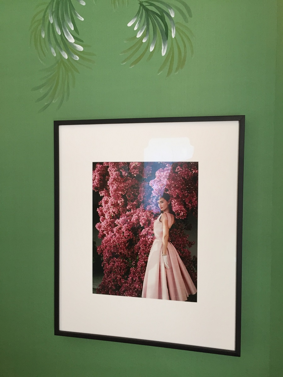
Here is a lovely, iconic photo of Hubert de Givenchy and his friend Audrey Hepburn walking along the Seine.

More images of Givenchy and Hepburn...

The bespoke wallpaper by de Gournay is not only hand-painted but hand embroidered as well! You can see it in the light detail at the bottom part of the leafy fronds. (Oh, by the way...the wallpaper alone for this room came in at a heart-stopping $65,000.)

Moving up the stately central staircase to the second level reveals an arresting wall treatment by artist Elan Evans. She took M.C. Esher's "Liberation" as a starting point and turned cut paper triangles into three dimensional origami birds soaring upward on a perfect turquoise sky.


The perfect turquoise continues to the landing of the second floor where Simon Breitbard Fine Arts has installed large-scale photos from Andy Freeberg's series Guardians which depicts women security guards, some obviously on a volunteer basis, in Russia's national museums.


Molie Malone turned a small bathroom into an edgy yet luxurious statement with a black and white graphic wallpaper that riffs on classical Greek design. Floor tiles made to look like patinated metal and a bright orange ceiling are the perfect foils.


A little boy's bedroom with a sweet, African safari-theme by Sherry Hope-Kennedy boasted a little ready-made fort based on the enormous mounds termites build on the veldt. The young man from Hope-Kennedy's design firm who was manning the room that day was encouraging people to get down on the floor and crawl inside to see the view up toward the roof of the structure. No one took him up on it except your blog master... because that is just how I roll. And it was worth it--look at how the chimneys appear from the ground looking up!


A bedroom for a teenage boy was both muted and exciting thanks to Ian Stallings' design skill. Not one afraid of a theme (see Stalling's Stevie Nicks-"White Witch" room from the 2016 Showcase here), he explained to me the inspiration for the many-textured stripes on the wall (the stripes when one adjusts the tracking on old VCR machines) and the deliberate height choices of the bed, art, armoire, and drapery rod. This room is a very personal manifestation of memory for Stallings who included movie posters from his youth and the very armoire from his bedroom when he was thirteen, the age of the boy this room was designed for. And of course the ultra-cool Lindsey Adelman light fixture is a thing to behold in and of itself.


Like I said earlier, no space is spared in a Showcase house and Krista Hoffman created a striking little bar area located on the loggia of the second floor she calls the "Curio Closet." Pewter wallpaper with matte black roses, deep blue cabinetry and shelving, and softly glowing sconces make this an engaging spot to stop and pour a bourbon...


Inspired by the classical revival period of the house itself as well as John Milton's idea of paradise from his epic poem "Paradise Lost," Beth Martins created a floating, ethereal sanctuary of a master bedroom. Light creams and tans offset by cornflower blue let this room whisper.


The fireplace surround is softly antiqued mirror.

But the element I most fell in love with in this glorious bedroom was the foggy ceiling painted by the incomparable Willem Racké. I just marveled at how the clouds of color shift without any clear boundaries. This is the work of a true master decorative painter.

"The Balancing Point" is what designer Kari McIntosh calls this home office/getaway for a busy, working mom who needs time and space to balance her family and her job, as well as herself. Located off the master bedroom as an antechamber to the master bathroom, the room is clad in St. Frank's Indigo Dots wallpaper (up close it feels charmingly like tie-dyed denim). A wonderful abstract art work gives this small room a big focal point.


I was particularly drawn to the chandelier...turns out this intriguing fixture is wrapped in silk cuttings from Bolt Textiles! It gives the chandelier an undefinable texture...it even looks as if it is covered in candle drippings! I love it!

Cecilie Starin (who created a show-stopping graffiti-inspired dining room for the 2015 Showcase house, previously seen here) titled her breathtaking master bathroom "Restore and Refresh." Every single element in here is pitch perfect. I adore the floating vanity with waterfall sides, the gorgeous bracelet chandelier, the marble-lined walls, the alternating herringbone floor, the high gloss cove ceiling installed by Starin's team, and the chic but organic gold/cream/tan color story.


Now I know some of you might be looking at the photos and thinking, "But she hung mirrors in the window!" Well, I know firsthand how interior designers often have to work within the limitations of existing architecture and plumbing. But Starin made sure the mirrors did not intrude too much and each one is hung on a pole featuring a mechanism that allows it to be pushed aside to let more light in...and of course to enjoy the million dollar view. Eighteen million dollars to be exact--the house is currently on the market.

Your blog master in Starin's room.

The water closet is a work of art too, with a textured wall treatment, a glass bubble light fixture, and contemporary California art.

And the spacious shower is a room unto itself...

Just as pitch perfect is Mead Quin's guest bathroom. It is fresh, white, and clean without being sterile or severe thanks to Quin's use of light wood and marble, organic materials which serve to ground a space and add natural warmth.


A great design I want to use in future bathroom designs is this notched handle glass door for the shower. Quin told me she does not like to use hardware on glass shower doors as it interrupts the material. And take a look at the waterfall tile that continues into the shower pan: Fireclay once again.

A green living wall was the focal point in a bedroom that was otherwise a little disjointed. Designer Jaimie Belew also transformed the closet of this room into a bright red laptop nook...with a desk and the Fiorita Chair by Giuseppe Rivadossi made from maple and a back made from actual stripped and sanded privet trees.


The third floor powder room by Stephen Stout and David Bjørngaard took its inspiration from ancient Roman baths. The rounded corners and limestone plaster walls look like they are hewn out of stone. The mirror tilts, recessed into the wall, and fades to white at the top, evoking steam from a spa. The sink below it is a stunning study in restraint. This is a remarkable space--despite the minimalism, the room conveys a rich story with subtle materials that need to be experienced in person.


Since the harried woman of the house got an office retreat, so too does the man. Another seductive and inviting dark space, designer Chris Eskra used both dark wood paneling and a striated paint effect on the walls of what he calls the "Executive Refuge." The live-edge desk is a one-of-a-kind piece of art (the burl at one end acts as a built-in shelf!). And the 1950s scroll side wingback chair with cabriole legs is by Arturo Pani, freshly recovered in a luscious grey mohair.


"The Thousand Watt Bathroom" is what Adele Salierno decided to call her space. She clad the shower in a rough hewn Cambria but the real star of the room was the vanity wall made of hundreds of...wait for it...drinking glasses embedded in a resin wall and backlit with LED light.


Here is a shot of the style of glass Salierno used...

...embedded so their bottoms face out and magnify the light within.

The teen girl's room by Kristen Peña is chic and sophisticated...what every thirteen year old girl aspires to be when she is exploring an identity and creating a personality of her own. Wallpaper by Juju, a Peg Woodoworking headboard, and hanging macramé rope lights by artist Wendy Chien bring layers of texture to this room.


Dina Bandman took de Gournay's hand-painted "Thousand Li" wallpaper as her starting point for a sumptuous laundry room/dog washing station (her portfolio shot shows a real dog in the basin but the day I was there, she naturally and adorably had a stuffed animal dog to convey the idea). You might notice that this is the second time de Gournay wallpaper is used at the Showcase and that is because this famed luxury brand just opened up a showroom in San Francisco! Bandman showed at last year's Showcase and did a powder room using de Gournay's fabulous Deco Monkey wallpaper, here.


The third floor's largest area is an airy lounge with balcony access. Catherine Kwong (who did a great Cy Twombly-inspired living room floor for the 2013 San Francisco Decorator Showcase seen here) was thinking of the California coast and places like Big Sur when she designed this elemental space with an adjacent bar. Unadorned windows let light flood in. Bleached wood walls, a live-edge cocktail table, a woven hemp rug, and the colors of the sky, pine trees, and the ocean, all seen through fog imbue this simple lounge with a tranquility that one could feel while sitting on a cliff at Esalen looking out over the Pacific Ocean. I love the subtle nod to surf culture with the picture of surfers over the bar...and of course she included a turntable to play old 70s gold...like "Hotel California" by The Eagles perhaps...


And here is the $18 million view from Kwong's California lounge...overlooking Alcatraz and Angel Island in the San Francisco Bay, looking north toward Marin, and topped by our glorious California sky. Just lovely.

If you are or will be in or near San Francisco, please try to visit this spectacular showcase of talent and materials. It is open through May 29, 2017. Check the website for times and additional information.
http://decoratorshowcase.org/

No comments:
Post a Comment