
Landscape designer Russell Martinelli reimagined the front for a curb appeal of quiet luxury featuring California-native and drought tolerant plantings with trees elevated in modern metal planters of slate grey. The front steps were also refinished with new material for a light, inviting walk up the stairs to the front entrance.


The first stop on the left was the perfectly appointed living room designed by Kimberly Denman Rebuffel and Laurent Rebuffel. Several items stood out for me in this gorgeous space: the leather-paneled (!) fireplace breast, the stunning disc-shaped McEwen Lighting chandelier, the beautiful Maya Romanoff wood veneer wallcovering that looks like like quilting, and some sensuously shaped lounge chairs. This space felt contemporary (even with--or maybe because of--an antique chest at the pier wall) but with a concern for comfort: the warm color palette and choice of organic materials (wood, leather) reinforced that feeling. The view from the set of French doors at the far end of the room normally gives out to a view of the Golden Gate Bridge but in heavy fog, all we could see was the deck (if you zoom in, you will be able to see it) and not the towers or cables.


A powder room and antechamber was designed by Robbie McMillan and Marcus Keller of AubreyMaxwell who named the area "...And The Hazy Sea Powder Room And Antechamber" which they outfitted with a variety of engaging textures and colors befitting their motif. A Phillip Jeffries wallcovering with a watery-effect landscape graced the walls, gold lighting fixtures cast a warm glow, and a custom rug that resembles rock strata grounded the space. Most striking was the full-wall mirror of carved wood, and the flooring in the powder room of a slab (a slab, mind you!) of Explosion Blue Quartzite that looked like the swirls of sea tides...the stone was so beautiful they had a custom vanity sink made from the same slab!


Next to the front entrance in the foyer is a little, tucked away space that must have begun life in the house as a coat closet (with a sweet little window of the original leaded glass) but designer Malone Detro made the most of it by transforming it into an alcove bar she called The Sunset Salon. The pub height bar of a solid piece of Patagonia Granite was backlit so the light coming through the sections of feldspar and quartz resembled the glow of a peaceful California sunset.


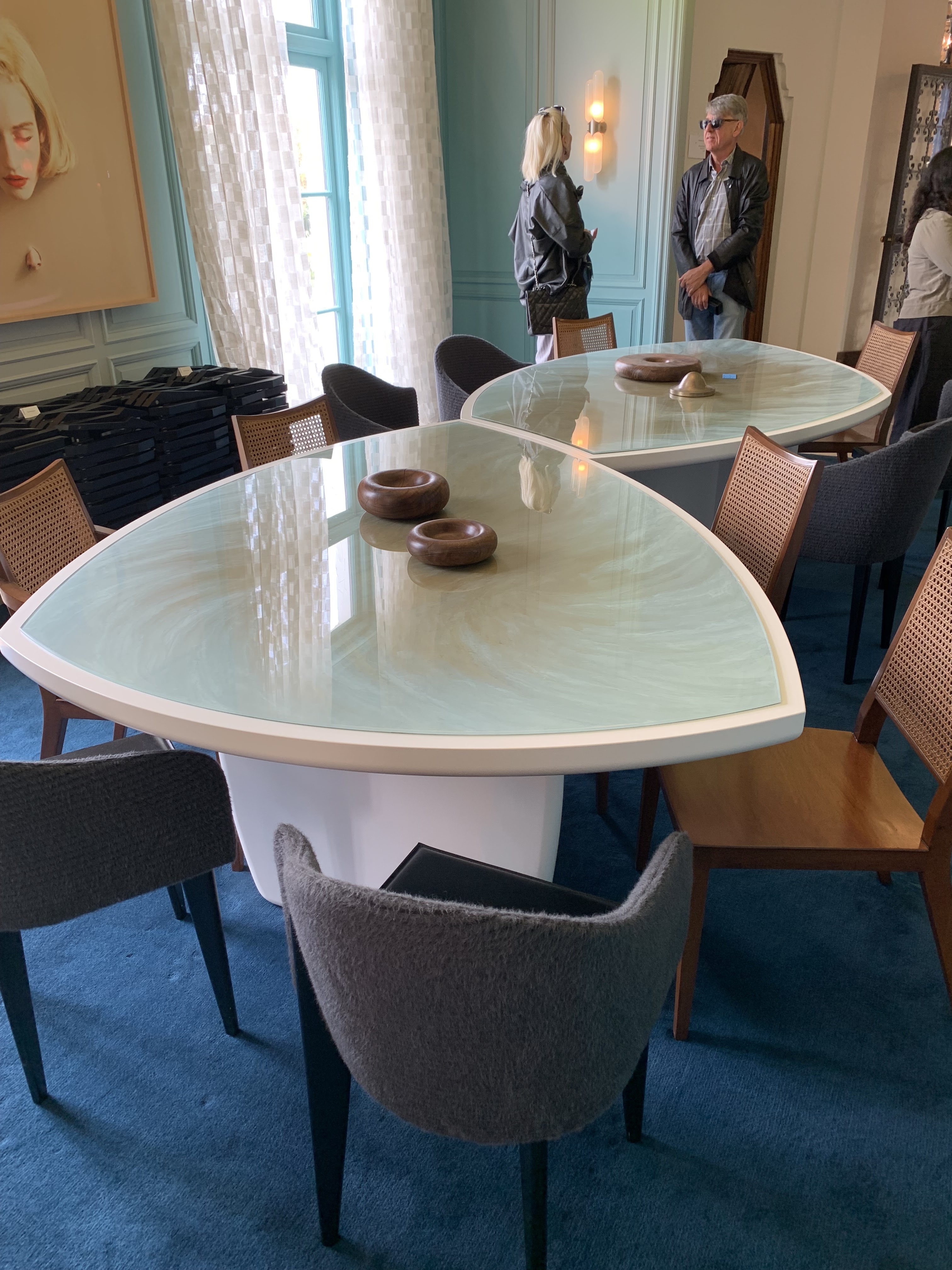
Next up was the Apollonia Dining Room from design team Alexis Tompkins and Leann Conquer of the firm Chroma. And the name of their company is quite accurate considering the subtle, whispering paint effect they created of shifting hues of blues, aquas, teals, and greens for the original paneled walls. Upholstered chairs sidled up next to wood chairs with cane backs at the unique dining table created by Julian Giuntoli.


Off the dining room is a sweet little breakfast room interior designer Dina Bandman calls the De Déjeuner à Dessert ("From Lunch To Dessert" in English) tea room. The room felt like an outpost of the venerable French pâtisserie Ladurée with a light, bright scheme featuring a handmade de Gournay wallcovering of hanging jasmine and a delightful palm-frond chandelier in white plaster. Plates resembling the line drawings of French genius Jean Cocteau and a hand-painted floor of a geometric pattern made it feel even more Gallic.


Our last room before heading upstairs was the kitchen, reimagined and updated by interior designer Lauren Berry. A sleek, calm backdrop to many gourmet meals to come, Berry's kitchen celebrated simplicity with exquisite, luxe materials. An adjacent seating area with a banquette was the perfect spot for guests to gather or to relax while your last tray of cookies bakes in the Hestan oven.


The Heller House has an elevator and while it might be small, it deserved the same design attention, so artist Elan Evans made an enchanting moment: poppies and a fox romp in a laser-cut field applied over fine wood veneer.

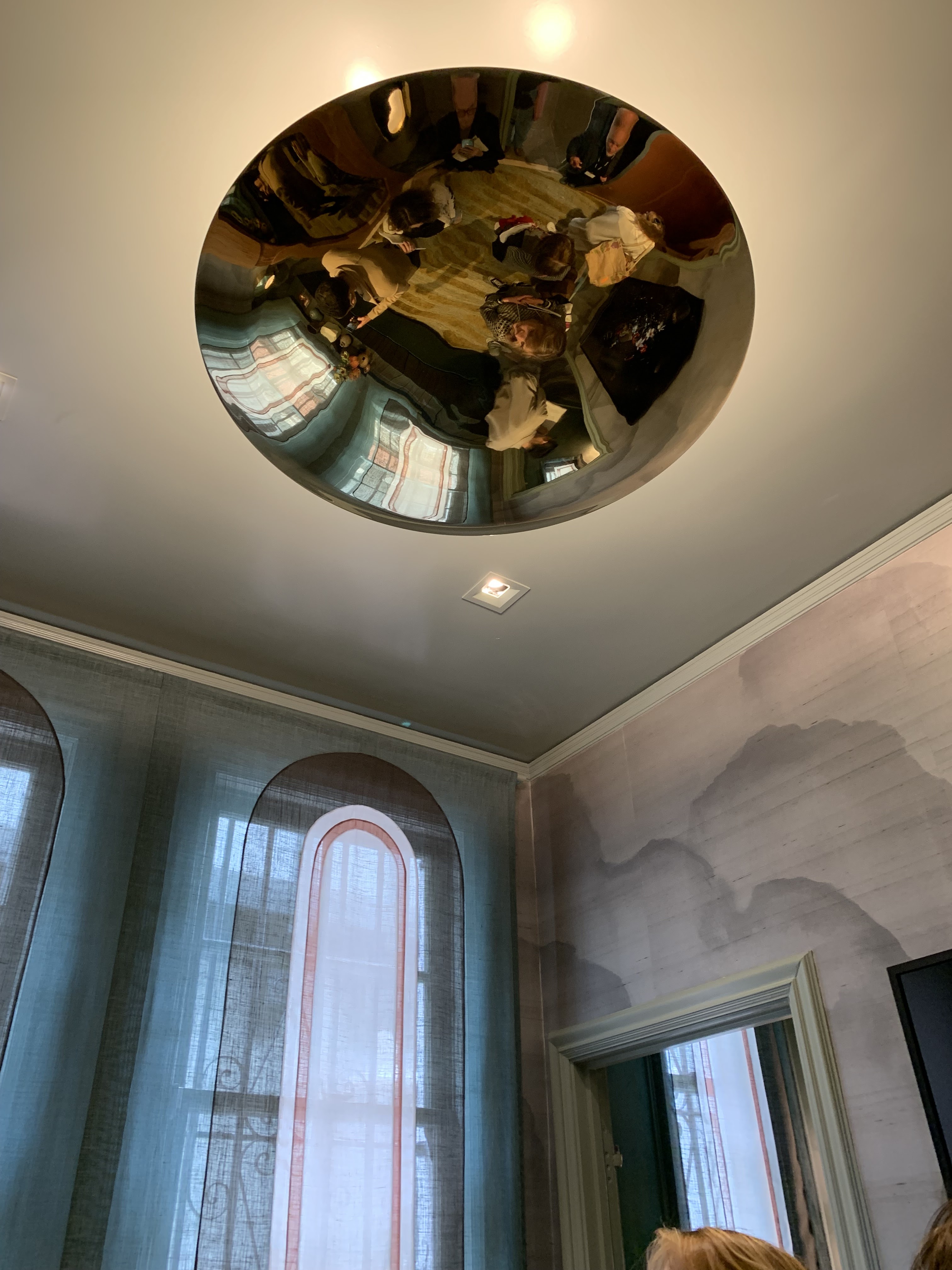
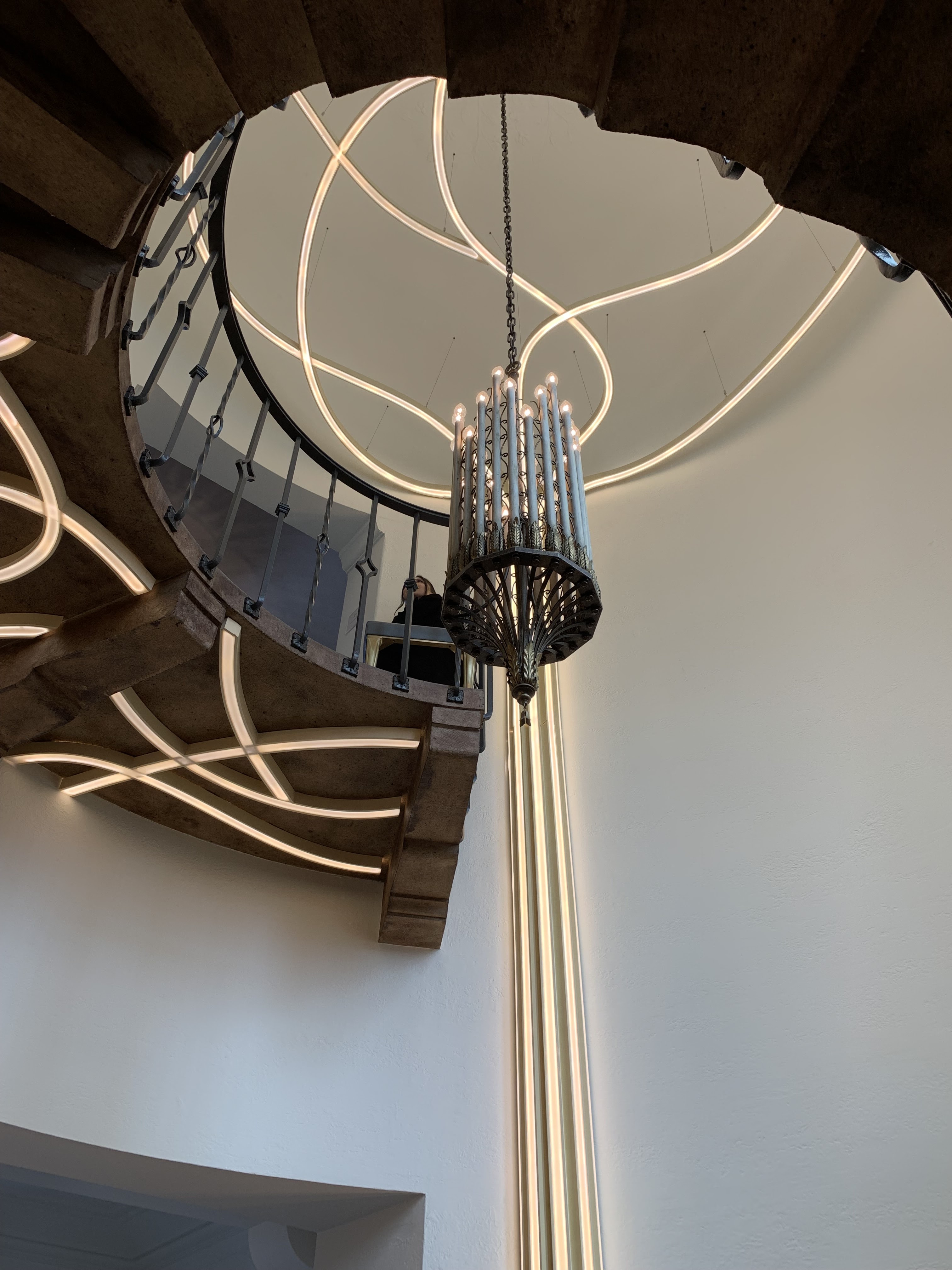
The floating spiral staircase of polished concrete that leads to the second floor--original to the house!--was home to a site-specific light installation by Roma Olisauskaite of Geddes Ulinskas Architects. The structure revealed itself slowly as you near the staircase...at first one saw a stylized tree trunk as it unfurled under the steps. Then one noticed another trunk growing all the way up to the ceiling, creating a Glowing Canopy reminiscent of a tree canopy in the forest. This incredible light installation was handmade by bending the wood framing using a custom mold based on the exact dimensions of the entire massive interior of the stairwell. A book illustrating the process was on display. The squiggly branches were inspired by the random squiggles in the leaded glass of the arched windows in the space (look closely and you can see them appearing here and there in the glass panes).


The stairs merge into a space interior designer Jon de la Cruz called The Upstairs Keep. The idea for this came from the archaic meaning of a Keep which, since Colonial times, meant "an area adjacent to the kitchen." Since this spot contained a fireplace, families would sleep here in the Keep in winter months for warmth. de la Cruz envisioned his Upstairs Keep for the family to stay warm in the morning or simply for gathering during the day or perhaps evening, taking advantage of a games table or a plush lounge set. A hand-knotted chandelier gave a marvelous center to the room and provided a focal point for the arched lines rising above. Lime washed walls and a silk and wool hand tufted rug offered tactile warmth.


Off the Upstairs Keep is the Primary Bedroom Suite. Star interior designer Tineke Triggs created "A Rare Gem" of a space based on the motif of gem stones with a soothing color palette of peridot, malachite, and jade. The hanging light fixtures at the bedside were adorned with quartz crystal formations, and the central flush mount light fixture as well as the wall sconces seemed to be made of gemstone paillettes. Delightfully, Triggs was on hand to host her room and when I spoke with her, we touched on another layer of inspiration which was the wild patterns of fashion designer Emelio Pucci. Once she revealed that, I saw it in the pattern of the drapery panels and the choice of wall art, as well as the jaw-dropping ceiling treatment created by talented muralist and artist Caroline Lizarraga.


Triggs also used her deft imagination to create the en suite bathroom she dubbed Curve Appeal, not only for the curved doorway leading to the water closet but for the scalloped edge of the floor where rounded tiles cut into the wood flooring from the bedroom. The lighting fixtures featured curves as did the wall tile at the sink vanity and a curved edge at the make-up station topped with a curved mirror. But what I really admire is that she used black water-proof plaster in the shower and continued it throughout the space. This bath certainly was sultry and sensuous.


Between the Rare Gem bedroom and the Curve Appeal bathroom is a walk-in closet that Triggs kitted out, topped with another Pucci-esque pattern on the ceiling!


His Modern Headquarters is a home office of dark cocooning colors, a place both to work but also to relax. The stand-out piece in this room was the custom made, asymmetrical desk by interior designer Lizette Bruckstein featuring an off-center pillar made from a gorgeous, multi-colored slab of Breccia Capraia marble cut into one inch strips and fabricated into the barrel shape you see below. Wow. The same stone was applied to the wet bar.


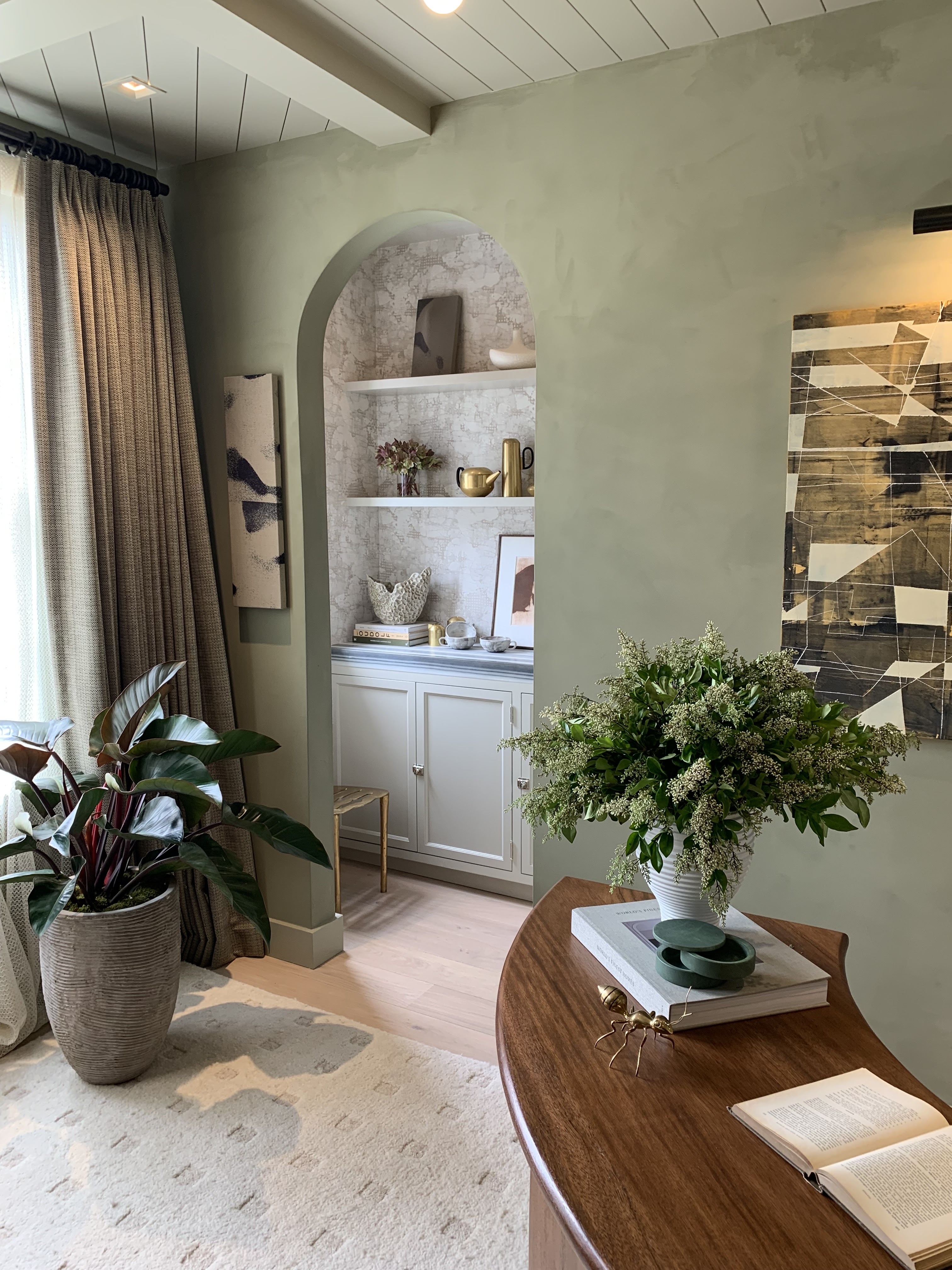
Where there is darkness, there is light and the next home office, simply called Her Study by interior designer Geoffrey Coy, is a place of calm, with a grounding wall color of lime-washed natural green. A coffee maker and beverage center was tucked into a corner alcove.


Now let's look at what was possibly the most energizing space of the entire Showcase, a bedroom for the homeowner's daughter. Sadie's Arty Party referenced the daughter's love for creativity with an explosion of color on the ceiling and drapery panels courtesy of a Pierre Frey wallcovering and fabric. Interior designers Eugenia and Emma Jesberg of EJ Interior Design created a bespoke headboard to accompany the fun, geometric rug. A near-life sized llama stood watch in the corner. And the closet was lined with a Schumacher wallcovering that on casual glance looked like a traditional floral print but upon closer inspection was revealed to be drawn with crayons!


Eugenia and Emma used the same bubbly exuberance for the en suite bathroom. The walls are lined with a stunning, custom cut-glass confetti tile from New Ravenna. I hope Sadie has a wonderful time soaking in the color and joy of this space!


While I admire the exubernace of Sadie's rooms, I was impressed with the older daughter's bedroom. Interior designer Chantal Lamberto created Montana's Monarchs as a subtle layered space that combined a contemporary sensibility with hints of tradition, all rooted in an experience of nature. A Schumacher wallcovering of butterflies and birds was an arresting backdrop to wicker and bleached wood. Classic handmade quilts and a reading nook made this room feel like a comforting sanctuary.


Lamberto created the adjoining bathroom to coordinate with the bedroom space and it all worked beautifully, from the minimal Porter Teleo wallcovering to the star pattern on the New Ravenna tile floor.


Before we get to the guest bedrooms, a laundry space by Mini Gangwal featured an adorable doggie themed wallcovering and pantry-style pull out cabinetry to make the space more efficient.


Interior designer Miyuki Yamaguchi turned a small guest bedroom into a jewel box with a wisteria patterned wallcovering and fabric from de Gournay.


The next guest suite by Stephanie Marsh Fillbrandt of Marsh and Clark Design featured an amazing ceiling treatment in the hallway even before entering the bath or bedroom areas. I won't even bother trying to describe it, just take a look...

The bathroom which Fillbrandt called The Nest is inspired by a shape from San Francisco artist Jay DeFoe's piece "The Rose" which is of a stylized rose in a sort of starburst pattern. Fillbrandt recreated this shape which resembles a pyrite disc on the walls of the bathroom, rendered in water-proof plaster. The same shape was seen on the walls of the hall.


This guest room was inspired by another artist. Van Gogh's painting The Kingfisher guided Fillbrandt in her choice of colors and fixtures. Artist Elan Evans (who did the elevator of poppies and a fox) painted marshy reeds on the wall while light fixtures in the shape of kingfishers flank the bed!


The basement level of the house featured recreational spaces. Max's Magical Playroom by Shelley Cahan and Sarah Wilson looks like it was right out of a Disney ride! A panorama of a fantastical seaside landscape seemed to be lifted from Peter Pan's Flight, kites flew overhead, a pink acrylic swing beckoned in a corner stuffed with soft felt "rocks," and references to Alice In Wonderland were peppered around.


A home theatre with a wildly colorful space theme by Noz Nozawa hit a 70s note, stylistically speaking. It was easy to see how the psychedelic swirls of nebulae played into her choices. To offer libations during movie nights, a wet bar on one side of the room balances out a wine cellar on the other, both perfectly outfitted to reflect the hallucinatory theme.


The media lounge's adjoining bathroom by interior designer Ruben Marquez is suitably dark and moody with a great tile design executed on the floor and black, grey, and slate zellige tiles on the walls.


And finally, every well-appointed home needs a dedicated exercise space, and this special slice by Kyle Hill was the perfect spot to do a bit of yoga, a bit of stretching, or a bit of rowing...


This year's Showcase hung together very well, and the house felt of a piece, of a coordianted design vision even with so many different creative minds and viewpoints coming together. While this year's Showcase is closed, I am already looking forward to next year! Visit the Showcase website to keep track of info for May of 2024.
http://decoratorshowcase.org/
