Showing posts with label KTZ. Show all posts
Sunday, June 11, 2017
BEAUTY: Clothing--KTZ SS'18
Like I said in an earlier post today, one of the jobs of artists--including fashion designers--is to hold up a mirror to society. Sometimes what is created in that mirror is beautiful, sometimes what is created is ugly. And make no mistake, this is an ugly time in our world history for many, many reasons.
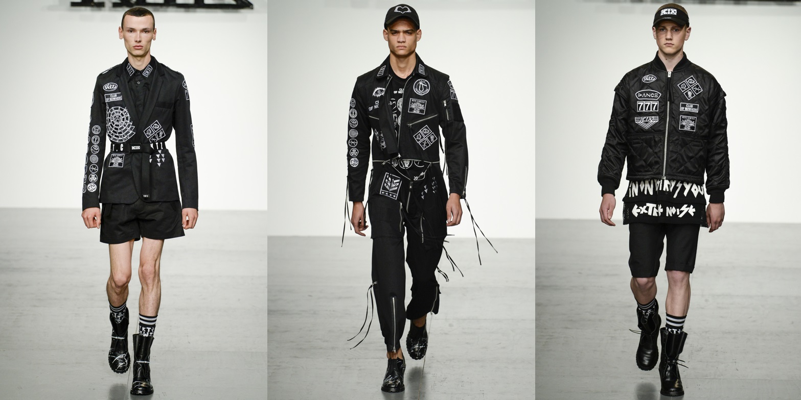
So for his line KTZ, designer Marjan Pejoski looked to the novel LORD OF THE FLIES for inspiration for his Spring Summer 2018 collection shown at London Fashion Week Men's. William Golding's 1954 story about a group of young, educated British schoolboys stranded on an uninhabited island and their swift descent into a savage state serves as a metaphor for the state of our world today. For clothing, it is a strong stance to take: sometimes the art produced by holding up the proverbial mirror is a bit too close for comfort. It is one thing to read a novel like LORD OF THE FLIES or even any of the terrifying speculative fiction of Margaret Atwood, but it is another thing to actually live through it...and we are close to that threshold.
Pejoski's little scout uniforms are slashed and stapled back together, makeshift junior warrior-wear tops are made of tabs from soda cans (detritus that the boys would find on the beach?), and chain mail works its way into trousers. Some kind of narrative is scrawled onto jackets....I can make out the words "extreme noise," "end of," "evil," and "destroy you." Is it a passage from LORD OF THE FLIES?
Pejoski's KTZ brand is known for its enthusiastic use of lettering, slogans, and symbols (previously here, here, and here). In that respect, this particular collection seems toned down...but when lettering, slogans, and symbols do show up, they are small, insidious, and deadly. On black scout uniforms transformed into Fascist regimentals, tiny patches show a mummified person with lips safety pinned shut, barbed wire, the Greek letter omega which is a traditional symbol for the end of something, the title "CLUB OF NOWHERE," and most frightening of all, the slogan, "THE WORLD TO COME," also abbreviated as "T.W.T.C."
For his Fall Winter '15-'16 collection seen here, Pejoski took the film "A Clockwork Orange" as inspiration for a precursor collection of Fascist thug wear, but the source material kept it theatrical. This current collection is not theatrical. And for that very reason, it is hard to take...it feels too real.
Just like Atwood's speculative fiction, Pejoski is saying that, given our current trajectory, and barring any course correction, this is where we are going to end up. It's a bleak outlook but understandable in the contemporary social climate. Like LORD OF THE FLIES, is it the fate of people to turn savage and authoritarian if left unchecked? Is it the default setting of our species? By extension, the next question is naturally, "Are humans basically good or basically bad?" I think we are still trying to work out the answer to that question. But sadly, the thing that we have not figured out as a species is that the answer to that question is one we decide.
http://k-t-z.co.uk/
So for his line KTZ, designer Marjan Pejoski looked to the novel LORD OF THE FLIES for inspiration for his Spring Summer 2018 collection shown at London Fashion Week Men's. William Golding's 1954 story about a group of young, educated British schoolboys stranded on an uninhabited island and their swift descent into a savage state serves as a metaphor for the state of our world today. For clothing, it is a strong stance to take: sometimes the art produced by holding up the proverbial mirror is a bit too close for comfort. It is one thing to read a novel like LORD OF THE FLIES or even any of the terrifying speculative fiction of Margaret Atwood, but it is another thing to actually live through it...and we are close to that threshold.
Pejoski's little scout uniforms are slashed and stapled back together, makeshift junior warrior-wear tops are made of tabs from soda cans (detritus that the boys would find on the beach?), and chain mail works its way into trousers. Some kind of narrative is scrawled onto jackets....I can make out the words "extreme noise," "end of," "evil," and "destroy you." Is it a passage from LORD OF THE FLIES?
Pejoski's KTZ brand is known for its enthusiastic use of lettering, slogans, and symbols (previously here, here, and here). In that respect, this particular collection seems toned down...but when lettering, slogans, and symbols do show up, they are small, insidious, and deadly. On black scout uniforms transformed into Fascist regimentals, tiny patches show a mummified person with lips safety pinned shut, barbed wire, the Greek letter omega which is a traditional symbol for the end of something, the title "CLUB OF NOWHERE," and most frightening of all, the slogan, "THE WORLD TO COME," also abbreviated as "T.W.T.C."
For his Fall Winter '15-'16 collection seen here, Pejoski took the film "A Clockwork Orange" as inspiration for a precursor collection of Fascist thug wear, but the source material kept it theatrical. This current collection is not theatrical. And for that very reason, it is hard to take...it feels too real.
Just like Atwood's speculative fiction, Pejoski is saying that, given our current trajectory, and barring any course correction, this is where we are going to end up. It's a bleak outlook but understandable in the contemporary social climate. Like LORD OF THE FLIES, is it the fate of people to turn savage and authoritarian if left unchecked? Is it the default setting of our species? By extension, the next question is naturally, "Are humans basically good or basically bad?" I think we are still trying to work out the answer to that question. But sadly, the thing that we have not figured out as a species is that the answer to that question is one we decide.
http://k-t-z.co.uk/
Sunday, January 11, 2015
BEAUTY: Clothing--KTZ
One of the things I find so fascinating and fulfilling to see during the shows is what designers look to for inspiration. We often see art, artists, historical figures, exotic places, and music as a springboard for a fertile imagination. But the single muse that seems to be more constant than others is the cinema.
For the '15-'16 Fall-Winter show at London Collections: Men, Marjan Pejoski at KTZ looked to the visual vernacular Kubrick employed in his film adaptation of Anthony Burgess' 1962 dystopian novella "A Clockwork Orange" starring Malcolm McDowell as the main character, Alex. Many elements of the film are referenced directly or indirectly. On the models, we see braces hanging down, leather bowler hats reminiscent of the bowlers worn by Alex and his gang, and, generally speaking, a black (and gray) and white color palette. It is easy to see how Kubrick's costume choices influenced this collection especially when one looks at the footwear and sees military, stomping boots or versions of Doc Martens on steroids, all references to "the old ultra-violence," a kind of senseless destruction and torture practiced by many in this dystopian world. Indirectly, we have on coats and jackets pixellated images of Lenin, Mao, and Marx done in what seems to be beadwork, and which refers to an encompassing sense both in the written and filmed versions of the story that the society in which Alex lives is either some form of Communism or perhaps a failed Socialist state that is evolving into Fascism--all set against a Soviet-era style poverty and bleakness (in the film, we see Soviet-era propaganda-style graphics and posters). Even the slang used by Alex and his friends is a kind of rhyming dialect based on Russian words (друг or drook means friend, and Alex considers his fellow gang members his droogs).
These pixellated images and patches with the phrases "Innocence," Generation," "Last Game," and "Violence" take the place of the usual indecipherable verbage on a typical KTZ piece. But the pixellated images get blown up into images that cover jackets and pants, creating a portrait that needs to be seen through squinted eyes to be recognized: an image of Malcolm McDowell from the Kubrick film, and a portrait of Beethoven, the classical composer adored like a rock star by Alex in the story. A raincoat (carried with umbrellas to reference the sequence where the gang beats a homeless man while singing "Singin' In The Rain") and a shaved fur overcoat sport the same words in the same "Clockwork Orange" font seen on the walls at the Milk Bar. (If you've not seen it, make an effort to see "A Clockwork Orange," one of Kubrick's many masterpieces.)
It is a risky choice to base a collection on such a book/film, not because of the source material, but for the fact that the collection ends up feeling extremely aggressive. Maybe the world has had enough aggression, especially considering the events of the last many days in Europe. But then maybe people are feeling mobilized and ready to fight back. Perhaps, for those of an artistic, intellectual bent, these pieces could function as a sort of armour...a mirror. It's a much harder, more brittle world than when the book and film were created...
http://k-t-z.co.uk/
For the '15-'16 Fall-Winter show at London Collections: Men, Marjan Pejoski at KTZ looked to the visual vernacular Kubrick employed in his film adaptation of Anthony Burgess' 1962 dystopian novella "A Clockwork Orange" starring Malcolm McDowell as the main character, Alex. Many elements of the film are referenced directly or indirectly. On the models, we see braces hanging down, leather bowler hats reminiscent of the bowlers worn by Alex and his gang, and, generally speaking, a black (and gray) and white color palette. It is easy to see how Kubrick's costume choices influenced this collection especially when one looks at the footwear and sees military, stomping boots or versions of Doc Martens on steroids, all references to "the old ultra-violence," a kind of senseless destruction and torture practiced by many in this dystopian world. Indirectly, we have on coats and jackets pixellated images of Lenin, Mao, and Marx done in what seems to be beadwork, and which refers to an encompassing sense both in the written and filmed versions of the story that the society in which Alex lives is either some form of Communism or perhaps a failed Socialist state that is evolving into Fascism--all set against a Soviet-era style poverty and bleakness (in the film, we see Soviet-era propaganda-style graphics and posters). Even the slang used by Alex and his friends is a kind of rhyming dialect based on Russian words (друг or drook means friend, and Alex considers his fellow gang members his droogs).
These pixellated images and patches with the phrases "Innocence," Generation," "Last Game," and "Violence" take the place of the usual indecipherable verbage on a typical KTZ piece. But the pixellated images get blown up into images that cover jackets and pants, creating a portrait that needs to be seen through squinted eyes to be recognized: an image of Malcolm McDowell from the Kubrick film, and a portrait of Beethoven, the classical composer adored like a rock star by Alex in the story. A raincoat (carried with umbrellas to reference the sequence where the gang beats a homeless man while singing "Singin' In The Rain") and a shaved fur overcoat sport the same words in the same "Clockwork Orange" font seen on the walls at the Milk Bar. (If you've not seen it, make an effort to see "A Clockwork Orange," one of Kubrick's many masterpieces.)
It is a risky choice to base a collection on such a book/film, not because of the source material, but for the fact that the collection ends up feeling extremely aggressive. Maybe the world has had enough aggression, especially considering the events of the last many days in Europe. But then maybe people are feeling mobilized and ready to fight back. Perhaps, for those of an artistic, intellectual bent, these pieces could function as a sort of armour...a mirror. It's a much harder, more brittle world than when the book and film were created...
And for those who have yet to see "A Clockwork Orange," here are some images from Kubrick's film for comparison:
http://k-t-z.co.uk/
Wednesday, June 18, 2014
BEAUTY: Clothing--KTZ
For many seasons, Marjan Pejoski, KTZ's Creative Director, has been obsessed with North Africa and the Middle East not so much for what each of those individual regional identities manifest but for the graphic representations the cultures from these areas create. He has explored Islamic geometric abstracts, Bedouin imagery including the "Hand of Fatima," and Berber embroidery. Despite the intricate nature of these graphics, or perhaps because of them, Pejoski manages to make his collections explode with a modern sensibility, an urban ferocity that seems like it belongs in a sci-fi film about a future society, or perhaps even an alien society on another planet (previously here).
So it is interesting to see the designer leave his familiar region and move on to explore another culture, this one not so much remote in region as remote in time. An interest in Classical Greece seems natural for a man with an interest in strong graphic design (and, it bears noting, he is Macedonian). So for his Spring/Summer '15 collection at London Collections: Men, strong, heavy imagery from Greek vases and friezes were woven into pieces that sported designs suggesting architectural details of Trojan temples. Jewelry incorporated gold coins or large reliefs of classical busts, brims of hats became Corinthian helmets, platform shoes were grafted onto Greek sandals, and caps sported gold wings like Hermes, the messenger of the gods. Pejoski usually works in a very limited color palette (neutrals like black, white, tan) but it seemed only natural to incorporate, delightfully so, the bright terra cotta orange of red figure pottery from Athens that was created between the beginning of the sixth and the end of the fourth centuries B.C.E.
I love how the breastplate is not meant to be armor, nor is it a take on Issey Miyake's breastplate (a sleek, stylized female plate in automotive acrylic with a peplum!): it is white, and clearly meant to be the white marble torso of a statue!
http://www.k-t-z.co.uk/
So it is interesting to see the designer leave his familiar region and move on to explore another culture, this one not so much remote in region as remote in time. An interest in Classical Greece seems natural for a man with an interest in strong graphic design (and, it bears noting, he is Macedonian). So for his Spring/Summer '15 collection at London Collections: Men, strong, heavy imagery from Greek vases and friezes were woven into pieces that sported designs suggesting architectural details of Trojan temples. Jewelry incorporated gold coins or large reliefs of classical busts, brims of hats became Corinthian helmets, platform shoes were grafted onto Greek sandals, and caps sported gold wings like Hermes, the messenger of the gods. Pejoski usually works in a very limited color palette (neutrals like black, white, tan) but it seemed only natural to incorporate, delightfully so, the bright terra cotta orange of red figure pottery from Athens that was created between the beginning of the sixth and the end of the fourth centuries B.C.E.
I love how the breastplate is not meant to be armor, nor is it a take on Issey Miyake's breastplate (a sleek, stylized female plate in automotive acrylic with a peplum!): it is white, and clearly meant to be the white marble torso of a statue!
http://www.k-t-z.co.uk/
Thursday, January 9, 2014
BEAUTY: Clothing--KTZ
Marjan Pejoski's KTZ label is a perfect example of why I "follow" fashion... and why it proves to be an inexhaustible source of creativity and inspiration. For many seasons now, Pejoski has been interested in the patterns and imagery of the Middle east and North Africa. Just take a look at his Moroccan-saturated Spring Summer '14 collection I blogged about here. So it comes as no surprise that his '14-'15 Fall Winter collection would continue in the same vein, complete with Berber jewelry. What is a surprise however is the total lack of color in the collection. A strictly black and white affair (like the McQueen show--do we have our Hundredth Monkey event? or maybe it is too soon to tell), even the models sported make-up that made them all appear as if they were trapped in a black and white film. Glancing down at the photos I have posted here, it honestly looks like the show was photographed in black and white--only the occasional telltale sign of color from the audience betrays the grey-toned secret.
And another surprising element is how Pejoski ties together the utter foreign-ness and alien-ness of North African and Bedouin culture (which, due to its sheer remote nature makes it foreign and alien to most of us in the rest of the world) with the idea of an equally foreign extraterrestrial culture. A consequence of his black and white models is that they all resemble aliens... literal aliens, from another planet. And the Bedouin designs take on an even more alien appearance in this context. Or rather de-context. Into this mix he has thrown in what appear to be Japanese Mon, or ancient circular family crests. The result is the sense of an alien language. As the collection eases off the black on black palette into white, we shift cultures one more time with the appearance of coats and hats reminiscent of Nepalese sherpa clothing. The pieces and limited color palette all seem appropriately chilly for a collection to be worn in the cold.
http://www.k-t-z.co.uk/
And another surprising element is how Pejoski ties together the utter foreign-ness and alien-ness of North African and Bedouin culture (which, due to its sheer remote nature makes it foreign and alien to most of us in the rest of the world) with the idea of an equally foreign extraterrestrial culture. A consequence of his black and white models is that they all resemble aliens... literal aliens, from another planet. And the Bedouin designs take on an even more alien appearance in this context. Or rather de-context. Into this mix he has thrown in what appear to be Japanese Mon, or ancient circular family crests. The result is the sense of an alien language. As the collection eases off the black on black palette into white, we shift cultures one more time with the appearance of coats and hats reminiscent of Nepalese sherpa clothing. The pieces and limited color palette all seem appropriately chilly for a collection to be worn in the cold.
http://www.k-t-z.co.uk/
Monday, June 17, 2013
BEAUTY: Clothing--KTZ
For London Collections: Men, KTZ (Kokon To Zai) presented quite a provocative Spring-Summer '14 collection. Marjan Pejoski (Creative Director of KTZ) and Koji Maruyama (Head of Design) looked to North Africa and the Middle East for inspiration. Decorated with silver buckles emblazoned with the word "TERROR," models sported white, black, or sand-colored ensembles based on traditional North African and Arab clothing such as the djellaba. Touches like masks and scarves traditionally protect from sand storms, sun exposure, and wind burn. And fantastic, massive accessories riffing on Bedouin jewelry adorned fingers and hung from necks and wrists. These exaggerated pieces feature traditional shapes seen in classic silver Bedouin jewelry such as domes, spheres, amulet cases, hanging bells, and geometric forms. In fact, KTZ blew these shapes up and applied them, in very large format, to outfits toward the end of the collection. The effect is quite startling. And in a stroke of brilliance, Pejoski and Maruyama used the domes and minarets from the jewelry to form "spikes" in some "punk" inspired clothing. Also of note is a segue into a great French Foreign Legion-inspired moment with more sporty pieces covered in beautiful cartography from antiquity.
Despite their effort to connect "TERROR" with North Africa and the Arab world (it should be noted that this connection is not really a stretch to anyone with a head), the collection actually feels rather true to the region and culture which inspired it. On the surface, it might seem inflammatory but upon closer inspection, one sees the authenticity mixed with optimism in the form of a pattern of the flags of the nations of the world. A few incongruous elements stick out, such as the Eastern yin-yang symbol, and a baseball-djellaba apparently from a team called "POISON." These are just quirky asides; for the greater part, it is a remarkable, fun, interesting collection.
http://www.k-t-z.co.uk
Despite their effort to connect "TERROR" with North Africa and the Arab world (it should be noted that this connection is not really a stretch to anyone with a head), the collection actually feels rather true to the region and culture which inspired it. On the surface, it might seem inflammatory but upon closer inspection, one sees the authenticity mixed with optimism in the form of a pattern of the flags of the nations of the world. A few incongruous elements stick out, such as the Eastern yin-yang symbol, and a baseball-djellaba apparently from a team called "POISON." These are just quirky asides; for the greater part, it is a remarkable, fun, interesting collection.
http://www.k-t-z.co.uk
Subscribe to:
Posts (Atom)